Introduction
Modern web development is not only about shipping code - it is about building experiences that adapt across devices. Yet many teams still stumble over the same vocabulary: screen resolution, viewport width, and device width rarely mean what they sound like.
Then lab tools enter the picture. Google Lighthouse and Chrome DevTools routinely evaluate frontend performance at fixed sizes such as 412px (mobile) and 1350px (desktop). Those dimensions are not universal hardware specs - so why do they keep showing up?
This article lines the concepts up side by side: what hardware pixels are for, what CSS actually lays out against, why several flagship phones still converge near ~412px in practice, and why Google standardizes viewports when measuring metrics like LCP and CLS. The outcome is practical: you design for ranges and interpret Lighthouse as controlled measurement, not as a single device target.
Related guides: Debugging hidden LCP issues when PageSpeed Insights passes, Lighthouse vs Core Web Vitals (lab vs field), the 28-day CrUX rolling window behind slow-moving vitals dashboards, and how CrUX collects real user performance data end-to-end.
Screen Resolution, Viewport Width, and Device Width
Understanding these three ideas is the foundation of responsive design.
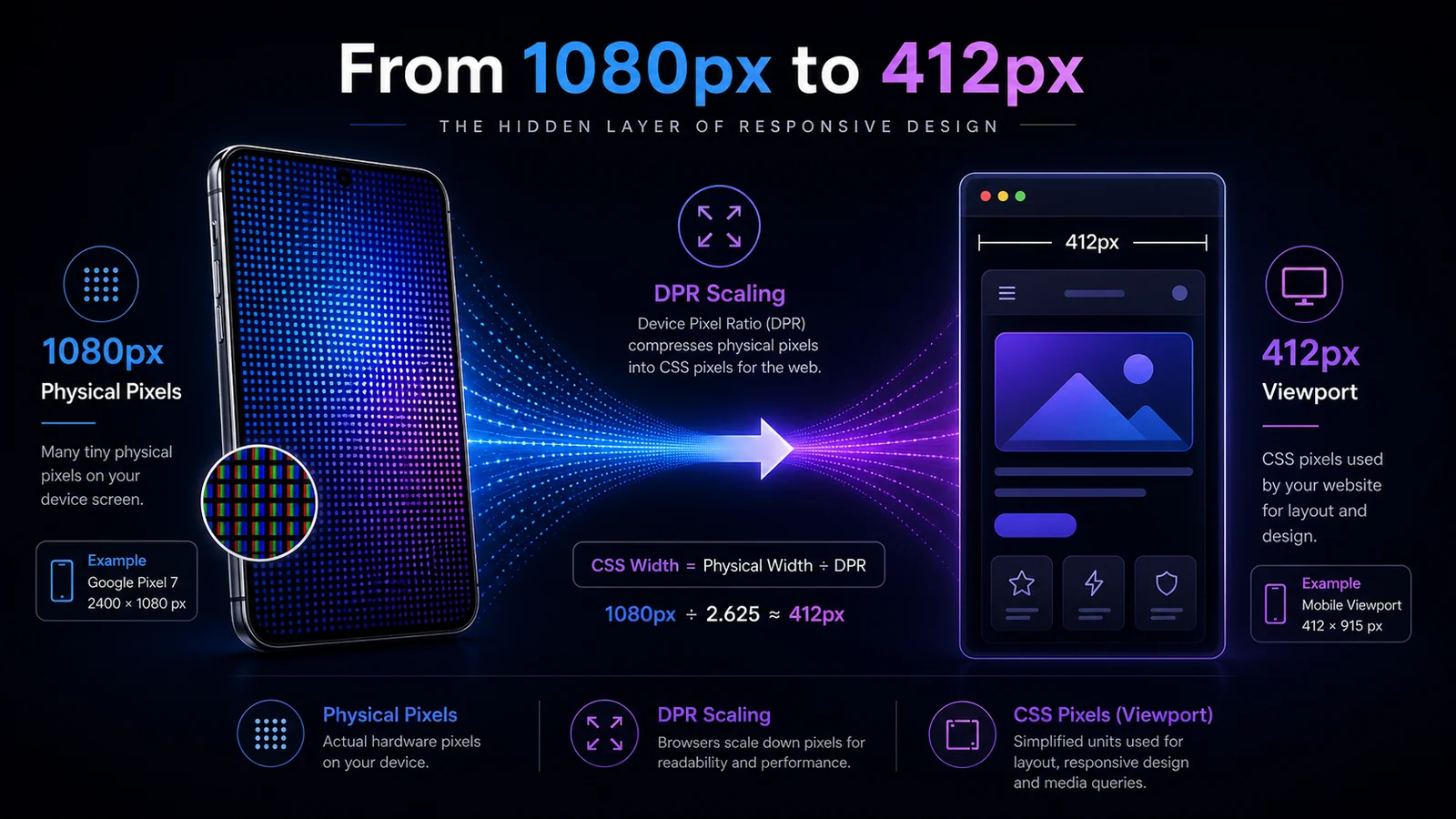
Screen Resolution (Physical Pixels)
Screen resolution is the hardware pixel grid on the display - the physical dots that paint the picture.
Examples:
- Google Pixel 7 -> 2400 × 1080
- Samsung Galaxy S23 -> 2340 × 1080
Key points:
- Fixed by the manufacturer
- Important for media (images and video - notably sharp assets and
srcset) - Not what
@mediawidth queries measure directly
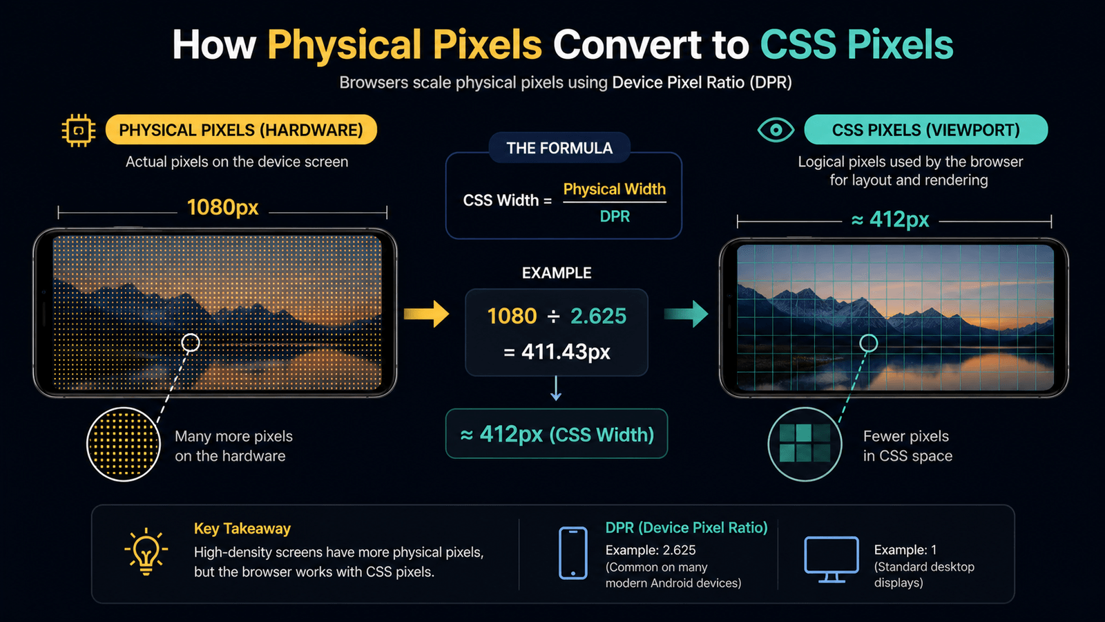
Physical Pixels vs CSS Pixels
Viewport Width (CSS Pixels)
Viewport width is what your site actually uses for layout: CSS pixels (logical / layout pixels).
Even when a panel is 1080 physical pixels wide, the layout often behaves like ~412px in CSS. That is device pixel ratio (DPR):
CSS width ≈ Physical width ÷ DPRExample:
1080 ÷ 2.625 ≈ 412pxThis drives:
@mediaqueries- Layout structure (flex, grid, typography)
- Overall responsive behavior
DPR Conversion Explained
Device Width (The Confusing Term)
This is where terminology misleads people.
| Earlier mental model | Today |
|---|---|
device-width often pointed at physical pixels | device-width-style media features are deprecated for new work |
| Easy to confuse with “real phone width” | Browsers expose viewport-oriented sizing to CSS |
Modern rule:
- Avoid relying on deprecated
device-widthpatterns - Prefer viewport-based queries (
min-width,max-width, container queries where appropriate)
For current guidance, see MDN: Using media queries for viewport sizing.
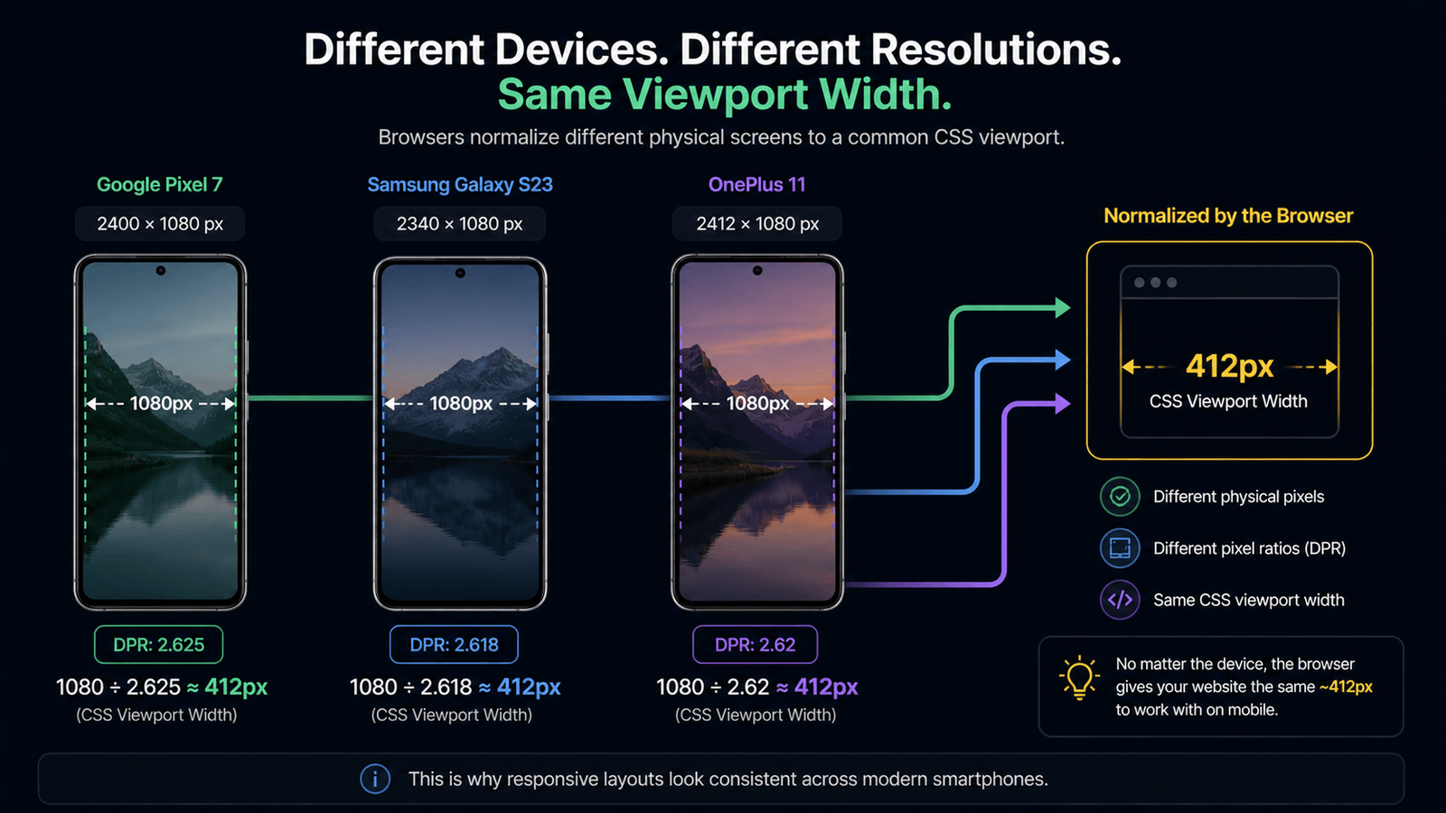
Why Different Phones Often Show Similar Width (Around 412px)
Devices such as:
- Google Pixel 7
- Samsung Galaxy S23
- OnePlus 11
…often land near ~412px viewport width in CSS despite different hardware resolutions.
Why?
- High-resolution panels are scaled so UI stays crisp
- Readability is prioritized over exposing raw physical pixels to layout
- Browsers normalize layout behavior across OEMs
Result: Similar CSS viewports across different phones - a consistency win for responsive patterns, even when spec sheets disagree.
Different Devices, Same Viewport
Why Google Uses 412px and 1350px in Testing
Tools such as Google Lighthouse simulate fixed environments, for example:
- Mobile -> 412 × 915
- Desktop -> ~1350 × 940
These are testing presets, not claims about a single real device.
Why 412px for Mobile
- Many phones fall in a 360 - 412px CSS-wide band in practice
- 412px reflects a large segment of Android-class layouts in aggregated data
It is a statistical anchor for the lab - not an industry-wide “standard phone.”
Why 1350px for Desktop
Users rarely use a maximized browser window on every session. Common logical widths include:
- 1366px
- 1440px (often with OS scaling)
1350px approximates real browsing conditions rather than “full panel resolution.”
Lighthouse Testing Viewports
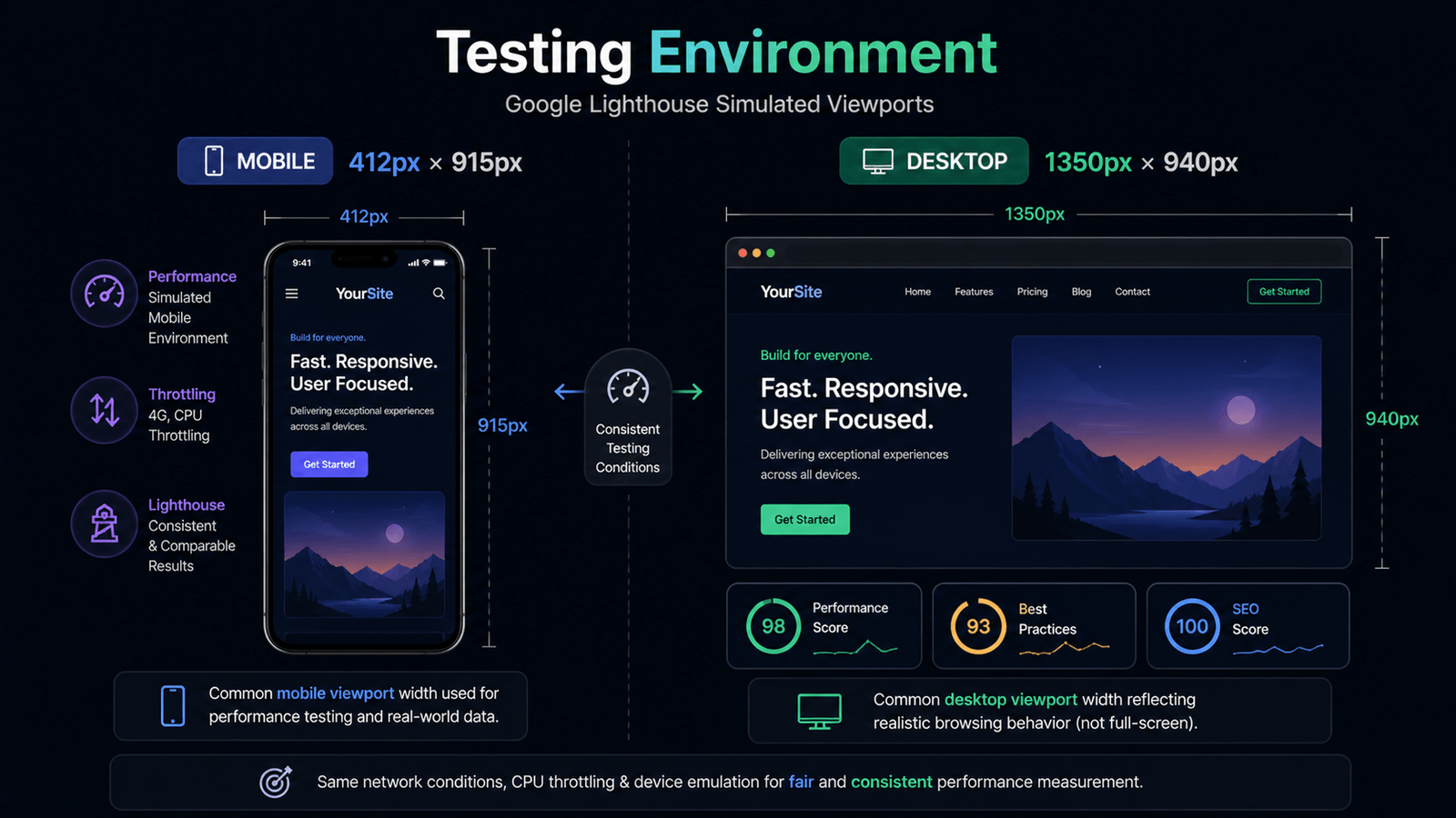
Consistent Performance Measurement
Metrics including:
- LCP (Largest Contentful Paint)
- CLS (Cumulative Layout Shift)
…change with viewport geometry (what is visible, element sizes, shifts).
So Google standardizes:
- Viewport dimensions
- Network profile
- CPU throttling
That yields:
- Fair comparisons across sites in the lab
- Repeatable benchmarks instead of chasing infinite device matrices
Common Misconception: “I Should Design Only for 412px”
“I should design only for 412px.”
Incorrect. 412px is a testing baseline for synthetic runs - not your only responsive target.
Best Practices for Developers
Use Responsive Breakpoints
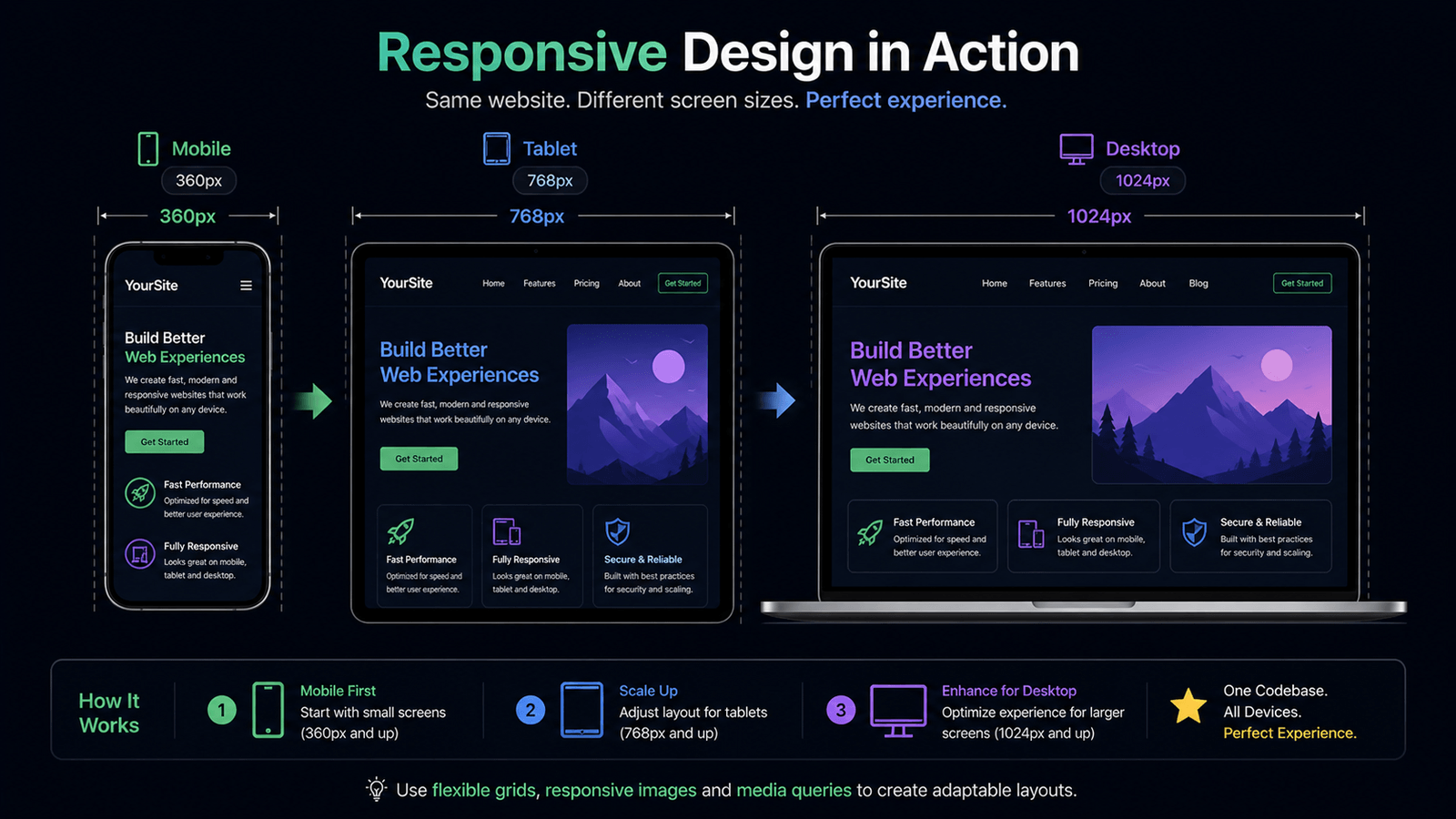
Anchor breakpoints to content and layout, not one Lighthouse preset:
@media (max-width: 480px) {
  /* Small phones */
}
@media (max-width: 768px) {
  /* Tablets */
}
@media (min-width: 1024px) {
  /* Desktops */
}
Test Across Real Ranges
Check reflow at widths such as:
- 360px - small phones
- 390 - 412px - modern phones
- 768px - tablets
- 1024px+ - desktops
Focus on Viewport, Not Resolution
Prioritize:
- CSS pixels as the layout contract
- Fluid layouts and flexible grids
- DevTools / device checks when validating performance - see Chrome DevTools device mode
Responsive Breakpoints Visualization
Conclusion
Key Takeaways
- Screen resolution = hardware pixels; important for media, not direct CSS layout width.
- Viewport width = CSS pixels - what
@mediaand layout actually see. - DPR explains why 1080-class hardware often maps to ~412px CSS width.
- Avoid deprecated
device-widththinking; use viewport-based queries for new CSS. - 412px × 915 and ~1350px × 940 are Lighthouse lab frames - useful for comparison, not exclusive design targets.
- Standardized viewport + throttling keeps lab Core Web Vitals comparable; combine with field data and multi-width testing.
- Design for ranges, not for one mythical device.
Next Steps
- Revisit breakpoints against real content reflow, not only the Lighthouse mobile preset.
- Cross-check lab fixes with CrUX / Search Console and several emulated widths.